
The Art of Color Grading: How to Set the Mood in Your Videos
Color grading is one of the most powerful tools a filmmaker or content creator can…
Color grading is one of the most powerful tools a filmmaker or content creator can use to shape the emotional impact of a video. While composition, lighting, and performance are essential, color has the unique ability to evoke specific feelings, guide the viewer’s attention, and define the style of your project. Understanding how to manipulate color allows you to create videos that not only look polished but also resonate on a deeper emotional level.
Understanding the Basics of Color Grading
Color grading is the process of adjusting the colors and tones of your footage to achieve a desired look. It can involve correcting exposure, balancing white levels, enhancing vibrancy, and creating stylistic color palettes. The goal is not only visual appeal but also consistency, mood, and storytelling.
Color grading starts with color correction, ensuring that the footage looks natural and balanced. Once the base is corrected, grading introduces creative choices that set the tone. A warm, golden palette can evoke nostalgia or intimacy, while cool, desaturated tones might create tension or a sense of isolation.
How Color Influences Mood
Different colors evoke different emotional responses. Red often communicates intensity, passion, or danger. Blue can feel calm, melancholic, or mysterious. Green may suggest growth, tranquility, or eeriness depending on the context. By combining hues, saturation levels, and contrast, you can craft an atmosphere that aligns with your story.
Color grading also affects how audiences perceive time, space, and energy in your video. High-contrast, vibrant colors create a sense of urgency and action, while muted, soft tones can slow the pace and invite reflection. Understanding these nuances helps you make deliberate choices rather than leaving color to chance.
Choosing the Right Palette
Selecting a color palette is one of the most important steps in creating mood. Start by defining the emotion or theme of your video. Research references from films, photography, and even paintings to see how colors are used to convey similar feelings. A cohesive palette ensures that every scene feels connected and intentional.
Consider complementary colors to create visual interest, or analogous colors to maintain harmony. Pay attention to skin tones, environmental hues, and lighting conditions, as these elements can enhance or clash with your chosen palette.
Tools and Techniques for Mood
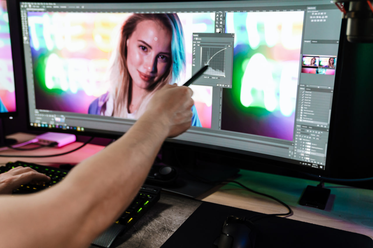
Modern software like DaVinci Resolve, Premiere Pro, and Final Cut Pro offers powerful tools for color grading. Use curves, color wheels, and LUTs (Look-Up Tables) to adjust brightness, contrast, and tone. Experiment with shadows, midtones, and highlights to emphasize details or create stylistic effects.
Masking and selective color adjustments allow you to isolate subjects and backgrounds, controlling the viewer’s focus and enhancing the narrative. Combining these techniques thoughtfully ensures that your grading supports the story rather than distracting from it.
Practical Tips for Effective Grading
- Consistency is Key – Maintain a consistent look across all shots to avoid jarring transitions that disrupt the mood.
- Reference Your Intent – Always grade with your desired emotional impact in mind, not just what looks visually appealing.
- Less is Often More – Subtle adjustments can have a stronger effect than extreme changes.
- Test Across Devices – Colors can appear differently on monitors, smartphones, and TVs, so review your work on multiple screens.
- Iterate and Experiment – Don’t be afraid to try different palettes or moods until the story feels right.